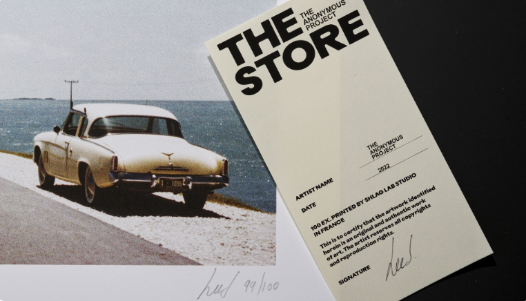
That's why I chose to present to you this press release from The Anonymous Project, which serves as the star performer of the month. A quick scroll reveals a very clear block structure and a simple and readable font, creating a well-spaced overall layout. Moreover, no one bothers to create any familiarity with a 'Hello [name]' or a barbarism like 'I hope this email finds you well.' No, here, we get straight to the point.
The rest of the press release is structured like a blog post. The project is detailed at the bottom of the page to provide some context. The press service contacts are clearly indicated.
And the links work!
These are details, but good readability (without spelling mistakes) makes you want to take the time to stop and read. Only the logo is in color, making the overall presentation lively and eye-catching without a Stabilo Boss color palette. It's pretty, clean, and simple. In 2023, it's super catchy.
>>> To read the Press Release of the Month: click here
Carla Peyrat (contributor)"


